
Components are the fundamental building blocks used to develop interactive web applications with Blazor. At their most basic level, they are reusable UI (User Interface) segments that can be composed together to create complex layouts, usually containing code that enables dynamic behaviour.
Blazor components (also known as Razor components) are one of the first things you will need to learn about when developing your first Blazor application.
In this article, I will walk you through the creation of your first Blazor component. This article will be helpful if you are new to Blazor and want to understand the basics for getting started with component development.
After following along with this article, you will have created a simple Blazor component featuring a parameter, data-binding, a C# method triggered by a click event, and a scoped CSS file. I will also show you how to move the C# code for your component into a separate file if that is your preference.
Creating the component
The following content is a continuation of my previous Getting started with Blazor article.
If you’re new to Blazor, I encourage you to read the aforementioned article. If you want to follow along with this article, make sure you have installed Visual Studio and that the Blazor template project that was created in the previous article is opened within Visual Studio before you begin.
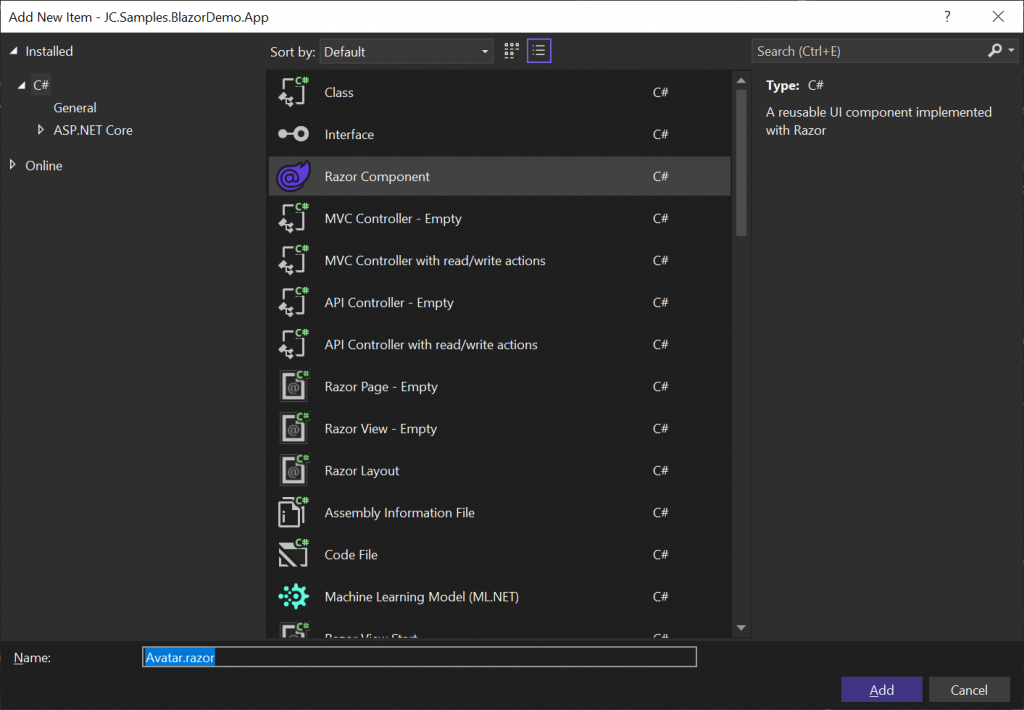
Within Visual Studio, right-click on the ‘Shared’ folder and select Add –> Razor component… from the context menu to load the Add New Item dialog.
Within the Add New Item dialog, give the component a Name of ‘Avatar.razor’ and then press the ‘Add’ button.
The new Razor file will open automatically and should contain the following contents.
<h3>Avatar</h3>

@code {

}
The contents of the file shown above represent a valid Razor/Blazor component. In this case, it is simply markup (the h3 element) and an @code block where C# code related to the component can be placed (more on this later).
Now, replace the above content with the following.
<div class="p-3">
    <img class="img-fluid img-thumbnail" src="https://i.pravatar.cc/?img=11" />
</div>
The above markup contains a div element with the Bootstrap CSS class ‘p-3’ applied to it to add some padding.
Within the div element, an img tag with some Bootstrap styles is used to display a specific avatar image from Pravatar.
Using the component
To use the component, we simply need to choose an appropriate place within a page (or another component) to insert it. For example, we can add the component within the ‘NavMenu.razor’ file in the ‘Shared’ folder of the demo project, as shown below.
<div class="top-row ps-3 navbar navbar-dark">
    <div class="container-fluid">
        <a class="navbar-brand" href="">Blazor Demo</a>
        <button title="Navigation menu" class="navbar-toggler" @onclick="ToggleNavMenu">
            <span class="navbar-toggler-icon"></span>
        </button>
    </div>
</div>

<Avatar/>

<div class="@NavMenuCssClass nav-scrollable" @onclick="ToggleNavMenu">
    <!-- Remainder of code omitted for brevity -->
When we run the Blazor application (via F5 or Ctrl + F5 ), the navigation menu within the home page will now render the Avatar component above the navigation links, as shown in the screenshot below.
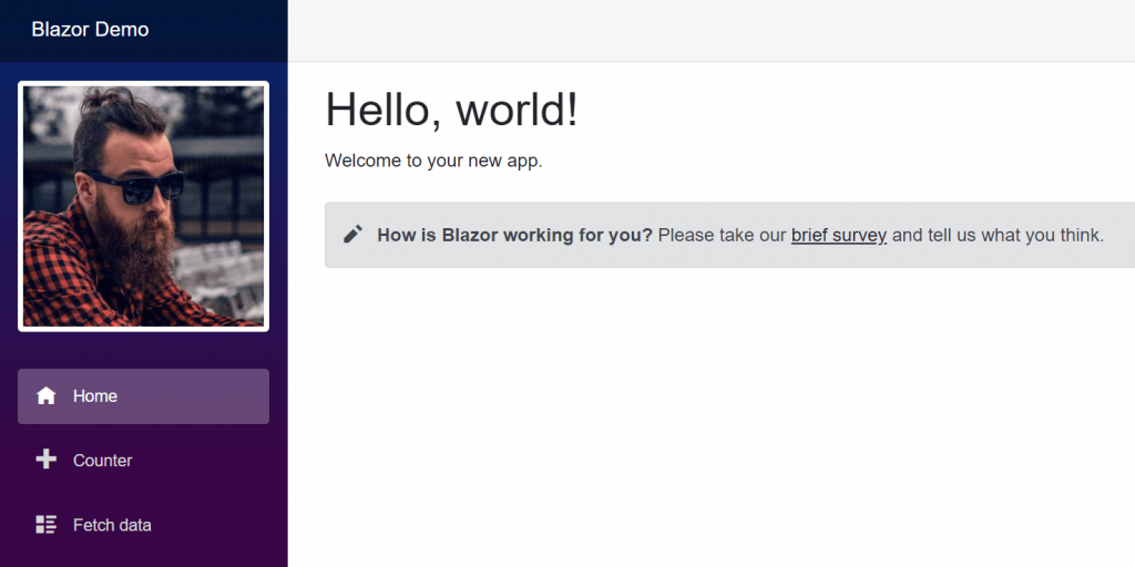
The Avatar component can be rendered in multiple places within the application, simply by including the <Avatar/> tag as shown further above. For example, if we wanted to show the Avatar component within the main home page content, we would add the <Avatar/> tag somewhere within the markup of the ‘Index.razor’ file found in the ‘Pages’ folder of the demo project.
Extending the component
At this stage, we have already created our first Blazor component, but it isn’t very functional at the moment.
Let’s address this in the following subsections.
Adding parameters
We have a potentially reusable component, but so far the component only contains markup.
To make the component more useful, we can add a parameter that will allow us to customise the image that it renders.
<div class="p-3">
    <img class="img-fluid img-thumbnail" src=@ImageUrl />
</div>

@code {
    [Parameter]
    public string ImageUrl { get; set; } = "https://i.pravatar.cc";
}
In the above example, an @code block has been added containing a C# property named ImageUrl. The property is decorated with the Parameter attribute which will allow us to set its value when we use the component.
The src attribute of img element has been updated to bind its value to the ImageUrl property. If the ImageUrl property is not set externally, then the default value assigned to the property will be used for the image source.
We can now update the ‘NavMenu.razor’ file to use the Avatar component as follows.
<Avatar ImageUrl="https://i.pravatar.cc/?img=16" />
Notice that a different image is now being specified via the ‘img’ query string parameter.
If you run the application again you should see that a different image is being displayed.
Adding more code
So far in the @code block we’ve just declared a C# property that is being used as a component parameter.
Let’s add a C# method that will be used to set a random image when the img element is clicked.
<div class="p-3">
    <img class="img-fluid img-thumbnail rounded" src=@ImageUrl @onclick=SetRandomImage />
</div>

@code {
    [Parameter]
    public string ImageUrl { get; set; } = "https://i.pravatar.cc";

    private void SetRandomImage()
    {
        ImageUrl = $"https://i.pravatar.cc/?img={Random.Shared.Next(1, 70)}";
    }
}
In the updated example above, a new SetRandomImage method has been added that will update the ImageUrl property when it is called. The Random class is used to generate a random integer number between 1 and 70, in accordance with the image IDs available on Pravatar.
An @onclick attribute has been added to the img element that will wire up the SetRandomImage method to be called whenever the img element is clicked.
When you run the application now you should find that a new image appears each time you click the avatar image.
Note that this is a contrived example and is only meant to demonstrate the concept of wiring up DOM events to C# methods.
Blazor stores an in-memory graph of components, known as a render tree, which it maps to the browser DOM. Blazor uses this component graph to determine which parts of the DOM need to be rendered again whenever changes to data-bound properties are made. Among other things, this approach improves performance, as updating the DOM can be an expensive operation.
Styling
CSS styles can be used within a component in the same way as with any other HTML, either by specifying inline styles or by referencing CSS classes as we’ve done so far in the Avatar component.
However, there’s another way to apply CSS with Blazor using CSS isolation. To achieve this, we need to add a file with the same name as the component, but with a ‘.css’ extension appended to it to create a scoped CSS file.
To illustrate this with the Avatar component, create a new file in the ‘Shared’ folder called ‘Avatar.razor.css’. You can do this in Visual Studio by right-clicking the Shared folder and going to Add –> New Item, then specify the aforementioned name and press the ‘Add’ button.
If you have file nesting enabled within Visual Studio, you should see the new file nested underneath the ‘App.razor’ file. Replace the default contents of the newly created CSS file with the following.
img {
    cursor: pointer
}
When you run the application again, you should now see that the mouse cursor changes to a pointer/hand symbol when you hover over the image.
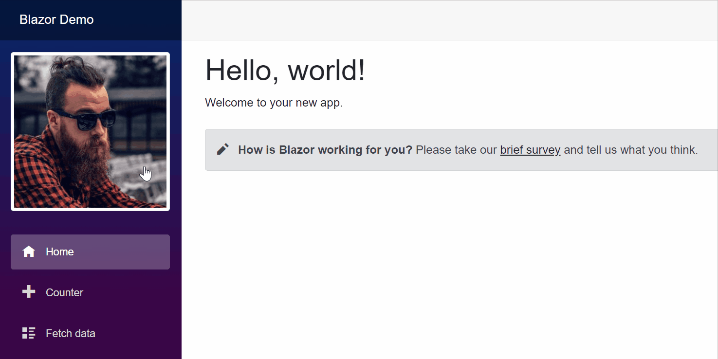
It is important to remember that because this is ‘scoped’ CSS, the above CSS rule will only be applied to the img element within the Avatar component. Images that may exist within other components on the page will be unaffected by this style.
Code approaches
When developing Blazor components, you should be aware that there are different ways to organise the code. We’ll look at the two main approaches in the following subsections.
Mixed approach
So far we have been placing our code within an @code block in the Razor file. This is known as the ‘mixed’ approach, where the markup and code are contained within the same file.
This approach works quite well and has some distinct advantages. For a start, it is convenient to have the markup and code in one place and this can help boost productivity as you don’t have to keep switching between files.
The mixed approach also allows you to see easily how large your components are becoming overall, in terms of the combined markup and code. When you notice the component getting too big you can consider breaking the component apart into smaller individual components.
Code behind approach
While the mixed approach has its advantages, many developers prefer to place their C# code in a separate file, based on the principle that the markup and logic are two separate concerns that should not be mixed.
The most common way to separate the code into a separate file is to create a partial class.
To see this approach in action for the Avatar component, create a new file in the ‘Shared’ folder called ‘Avatar.razor.cs’. You can do this in Visual Studio by right-clicking the Shared folder and going to Add –> New Item then specify the aforementioned name and press the ‘Add’ button.
If you have file nesting enabled within Visual Studio, you should see the new file nested underneath the ‘App.razor’ file.
Now grab the code within the @code block of the ‘Avatar.razor’ file and paste it within the curly braces of the Avatar class in the newly created C# file. Add the partial keyword to the Avatar class as shown below.
public partial class Avatar
Lastly, remove the @code block from the ‘Avatar.razor’ file to tidy things up.
If you now run the application you should find that it continues to work as it did before.
Inheritance
It’s also possible to use inheritance when separating your code into another file.
To enable this, you would remove the partial keyword from the Avatar class you just created and make the class inherit from ComponentBase, as shown below.
public class AvatarBase : ComponentBase
You would then need to add a line to the top of the Avatar component, as follows.
@inherits AvatarBase
You’ll also want to rename the file containing the class from ‘Avatar.razor.cs’ to ‘AvatarBase.cs’.
The advantage of this approach is that it allows you to make all of your components inherit from a custom base class that provides additional features that are specific to your application. As long as your component ultimately derives from ComponentBase you can have as many layers of inheritance as you like.
Summary
I’ve only scratched the surface of what’s possible with Blazor components. There are a lot of other concepts that you’ll need to understand as a Blazor developer, such as two-way data-binding, event callbacks, child content, and cascading values. I will be covering these topics and more in future articles.
To summarise this article, we’ve looked at how to create your first Blazor component using Visual Studio.
We created a contrived Avatar component and added it to the NavMenu component. We extended the component by adding a parameter and a method that is executed on a click event.
Following this, we looked at how you can create scoped CSS styling rules in a separate file and we reviewed the different approaches that are possible in relation to where the C# code for your component is located.
Comments