

Data binding is a core feature of practically all front-end SPA (Single-page application) frameworks, including Blazor.
Blazor provides lots of useful data-binding features that are enabled by using specific Razor syntax within components.
In this article, I will cover the fundamental concepts of data binding with Blazor. After reading the article, you will understand the difference between one-way and two-way data binding and how to bind data to form input controls.
One-way data binding
The simplest kind of data binding we can do in Blazor is one-way data binding by specifying the name of a C# member, such as a property that we want to bind to, with the name of the member prefixed with an @ symbol.
Note that this article assumes you are working from the default Blazor template project (see my Getting started with Blazor article) and are using Visual Studio. However, if your project or environment is different you can still follow along and adjust the instructions according to your specific setup.
Component example
See the UsernameDisplay component below which provides an example of one-way data binding in action.
<label class="fw-bold">Username</label>
<p>@Username</p>

@code {
    [Parameter, EditorRequired]
    public string Username { get; set; } = "";
}
The markup in the above example contains a label element with a Bootstrap class that makes the fixed ‘Username’ text bold.
Within the p tag, data binding to the Username property is configured.
The @code block defines a Username property which has been configured as a component parameter via the Parameter attribute. This allows the value of the property to be specified when using the component within another component or page.
The EditorRequired attribute has also been specified. As a result, if a consumer of the component does not specify a value for the property, a compiler warning will be raised.
Using the component
To see what the component looks like in a running Blazor application, replace the content of the ‘Index.razor’ page within the default Blazor template project with the following.
Alternatively, create a new page component in your project and update the @page route accordingly.
@page "/"

<PageTitle>Index</PageTitle>

<h3>One-way data binding</h3>
<hr />
<UsernameDisplay Username="Jonathan" />
Now run your application to see the output.
Component output
If you updated the main ‘Index.razor’ page as suggested in the previous subsection, you should see the component output as soon as the application has finished loading.
As expected, the output of the component is very basic, as shown below.
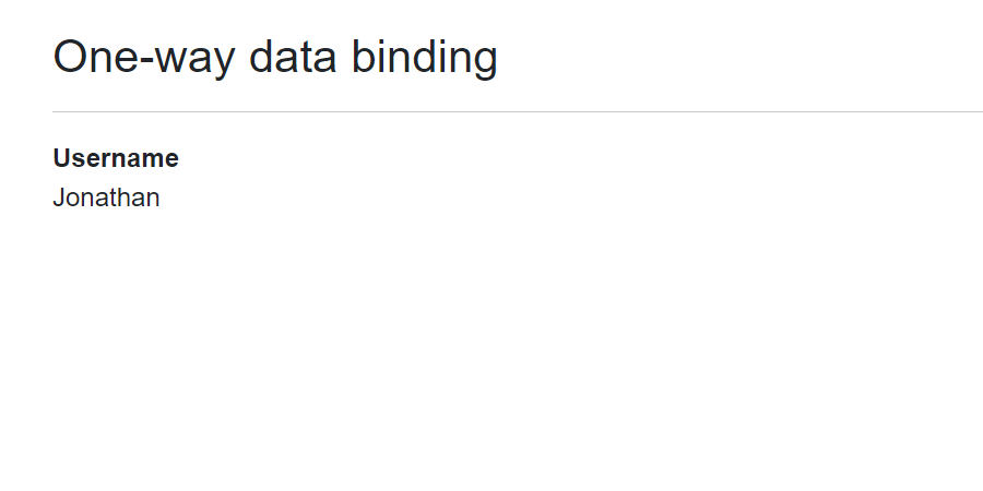
With one-way data binding, data flows in one direction; from the component to the view. Therefore, if the Username property was to change its value in the code, a component re-render would be triggered and the new value would be reflected on the view. Blazor uses a smart ‘diff mechanism’ which means that only the specific part of the DOM that needs to change will be updated, the rest of the DOM will remain static.
However, what if we want changes to a bound data value on the view to flow back to the underlying component and update the property value there? We’ll look at how to achieve this next.
Two-way data binding
Two-way data binding allows changes that are made to data in the view to flow back to the component.
Component example
Below is a UsernameEditor component which provides an example of two-way data binding in action.
<label class="fw-bold">Username</label>
<p>@Username</p>

<textarea class="w-100" rows="1" @bind=Username @bind:event="oninput" />

@code {
    [Parameter, EditorRequired]
    public string Username { get; set; } = "";
}
The contents of the above component are the same as the UsernameDisplay component from the previous subsection, except that a new div containing a textarea has been added.
I’ve used a textarea in the example to demonstrate that two-way data binding can be configured for regular HTML input elements, as well as Blazor-specific ‘Input’ elements which we’ll cover later.
The textarea has been given a width of 100% via the Bootstrap ‘w-100’ class and the number of rows for the textarea has been set to a value of ‘1’ so that the textarea defaults to the height of one line of text.
The key part to notice in relation to data binding is the Blazor @bind attribute. This is what configures the two-way data binding to the Username property. Additionally, the @bind:event attribute specifies that the Username property value should be updated whenever the input event for the textarea is raised. Without specifying this, the property value would only be updated when the change event is fired i.e. when the textarea loses focus.
Using the component
Now, add the following markup to the ‘Index.razor’ page and run the application again.
<h3>Two-way data binding</h3>
<hr />
<UsernameEditor Username="Jonathan" />
Alternatively, add the above markup to another page component in your project.
After doing the above, run the application to see the output of the component.
Component output
The output of this component is more interesting than the previous one, as demonstrated below.
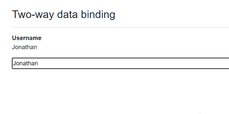
As you can see from the above animation when the username is edited via the textarea, the underlying value of the property is also updated and this is reflected in the paragraph above the control on each keystroke.
Form input data binding
Data binding within a form in a Blazor application is achieved in a similar manner to what was covered in the previous subsection, using a variant of the @bind syntax.
Component example
Below is a UserForm component which provides an example of form data binding in action.
Note that this form has been kept as simple as possible and therefore doesn’t include any form submission capability, as we are focusing purely on the data-binding aspects of the form.
<EditForm Model=_model>
    <div>
        <label class="fw-bold" for="username">
            Username
        </label>
        <div id="username">
            <InputText @bind-Value=_model.Username />
        </div>
    </div>
    <div class="pt-2">
        <label class="fw-bold" for="email">
            Email
        </label>
        <div id="email">
            <InputText @bind-Value=_model.Email />
        </div>
    </div>
</EditForm>

<p class="pt-3">
    Username is <b>@(_model.Username.Length > 0 ? _model.Username : "blank")</b> and
    Email is <b>@(_model.Email.Length > 0 ? _model.Email : "blank")</b>
</p>

@code {
    private readonly UserModel _model = new();

    public class UserModel
    {
        public string Username { get; set; } = "";
        public string Email { get; set; } = "";
    }
}
In the above example, an EditForm component is used to build the form. EditForm is a built-in Blazor component that outputs a standard HTML form, but offers additional benefits such as simplified validation.
The EditForm accepts a data model to bind to via its Model parameter. In this case, a UserModel object is bound to the form.
Note that the UserModel class has been defined within the @code block to keep things simple for the example. Usually, you would define classes like this in a separate ‘.cs’ file.
Within the EditForm there are some div and label elements. The label elements specify a for attribute which links the label to an associated input control via its id attribute (doing this means that when the label is clicked on it will focus on the corresponding input control).
The InputText component is used as the input control for capturing data from the user. This component wraps a standard HTML input element with a type of text and exposes a Value property that we can bind to. The Razor syntax to bind to a specific component property is @bind-PropertyName. In this case, @bind-Value.
Within the p tag below the form, the @() syntax is used to allow some C# code to be evaluated. If the length of the Username or Email properties are greater than zero, their respective property values will be rendered, otherwise the text ‘blank’ will be rendered.
When the bound data is updated via the form input controls, the updated values will flow back to the properties in the code and the text on the screen will be updated accordingly.
Using the component
Now, add the following markup to the ‘Index.razor’ page and run the application again.
<h3 class="pt-3">Form data binding</h3>
<hr />
<UserForm />
Alternatively, add the above markup to another page component in your project.
Following this, run the application again to see the output of the component.
Component output
The output and behaviour of the component are demonstrated below.
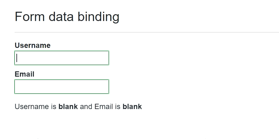
In the above demonstration, the ‘Username’ field is populated and the Tab key is pressed to shift focus to the ‘Email’ field. Doing so causes the value of the Username property to be updated and this is reflected in the text below the form.
The ‘Email’ field is then populated and the Tab key is pressed again, causing the ‘change’ event to fire and the text below the form to be updated with the value of the Email property.
Note that if you want to update the value of the bound data when a different event such as ‘oninput’ is fired, you’ll need to use inheritance to derive a subclass from the InputText component and override its default behaviour.
Summary
In this article, I have covered the fundamentals of how data binding works in Blazor.
I’ve covered simple one-way data binding to properties and compared this with how two-way data binding works using the @bind syntax. Additionally, I’ve shown how you can data bind to form InputText controls using the @bind-Value syntax.
At this stage, you’ve seen the basics of how data binding works and the examples shown in this article should cover what you need to know regarding data binding for most day-to-day coding in Blazor. However, some additional things you may want to explore next are using @bind:get and @bind:set to bind to properties with get and set accessors, and using @bind:format to specify the display format of bound data e.g. @bind:format="yyyy-MM-dd".
Comments