
If you’ve been working with Blazor for any length of time, it probably won’t be very long before you encounter the “yellow bar of death” which is displayed at the bottom of the browser window any time an unhandled exception occurs.
Whenever this exception bar appears for Blazor Server apps, a page refresh is required before you can proceed further. Blazor WebAssembly is a bit more forgiving, allowing you to continue using the application, however, the exception bar will remain in place until you dismiss it or refresh the page.
In either case, the exception bar is an indication that an unexpected error has occurred which the application is not currently handling. Wouldn’t it be nice if we could capture these errors and display a more friendly error message to our users?
In this article, I will cover the concept of ‘error boundaries‘ in Blazor. Error boundaries provide a straightforward way to capture errors and control how far they can propagate up through the hierarchy of application components.
The “yellow bar of death”
Unless you’re working with an existing Blazor application that already has a comprehensive error-handling strategy, you’ll probably be familiar with the “yellow bar of death” (i.e. exception bar) which is displayed at the bottom of the browser window.
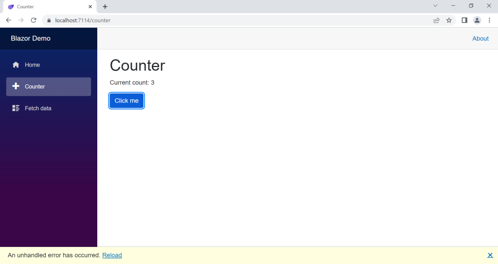
As you can see from the above screenshot, the exception bar displays the generic “An unhandled error has occurred.” text, along with a ‘Reload’ hyperlink, and a dismiss option. To trigger this error, I updated the @code section within the Counter component that ships with the default Blazor project template, as per the code shown below.
Note that this article assumes you are working from the default Blazor template project (see my Getting started with Blazor article) and are using Visual Studio. However, if your project or environment is different you can still follow along and adjust the instructions according to your specific setup.
@page "/counter"

<PageTitle>Counter</PageTitle>

<h1>Counter</h1>

<p role="status">Current count: @currentCount</p>

<button class="btn btn-primary" @onclick="IncrementCount">Click me</button>

@code {
    private int currentCount = 0;

    private void IncrementCount()
    {
        currentCount++;

        if (currentCount > 3)
        {
            throw new Exception("Maximum count exceeded!");
        }
    }
}
The IncrementCount method in the above code checks if the value of the currentCount field exceeds a value of ‘3’ and if this is the case, an exception is thrown. Aside from this, the markup and code are the same as the standard Counter component.
The exception bar is part of the default Blazor project template and the following markup contained within the ‘index.html’ file is used to render it.
<div id="blazor-error-ui">
    An unhandled error has occurred.
    <a href="" class="reload">Reload</a>
    <a class="dismiss">🗙</a>
</div>
Along with this, the following CSS contained within the ‘app.css’ file is used to style the exception bar.
#blazor-error-ui {
    background: lightyellow;
    bottom: 0;
    box-shadow: 0 -1px 2px rgba(0, 0, 0, 0.2);
    display: none;
    left: 0;
    padding: 0.6rem 1.25rem 0.7rem 1.25rem;
    position: fixed;
    width: 100%;
    z-index: 1000;
}

    #blazor-error-ui .dismiss {
        cursor: pointer;
        position: absolute;
        right: 0.75rem;
        top: 0.5rem;
    }
You may choose to update the styling according to your needs. However, in either case, it is generally best to keep the exception bar markup in place. Regardless of your error-handling strategy, the exception bar will continue to act as the fallback mechanism in case any unhandled exceptions slip through the net.
Error boundaries to the rescue
Error boundaries in Blazor provide a convenient way to capture unhandled exceptions, log the exception details, and display customised error content on the page in a user-friendly manner.
The simplest approach for implementing error boundaries is to add an ErrorBoundary component at the layout level of your Blazor application.
By way of example, see the contents of the ‘MainLayout.razor’ file below.
@inherits LayoutComponentBase

<div class="page">
    <div class="sidebar">
        <NavMenu />
    </div>

    <main>
        <div class="top-row px-4">
            <a href="https://docs.microsoft.com/aspnet/" target="_blank">About</a>
        </div>

        <article class="content px-4">
            <ErrorBoundary>
                @Body
            </ErrorBoundary>
        </article>
    </main>
</div>
The above markup is the same as the default MainLayout component, except that the @Body render fragment has been surrounded with an ErrorBoundary component.
Please note that although implementing an error boundary at the layout level allows us to catch most of the errors that can occur within a Blazor application, it is recommended that you scope your error boundaries more narrowly than this i.e you should wrap specific parts of the component hierarchy where errors could occur with separate error boundaries.
As a result of the above updates to the MainLayout component, the exception that is thrown by the Counter page component will be caught by the error boundary and the user interface will look similar to the screenshot shown below.
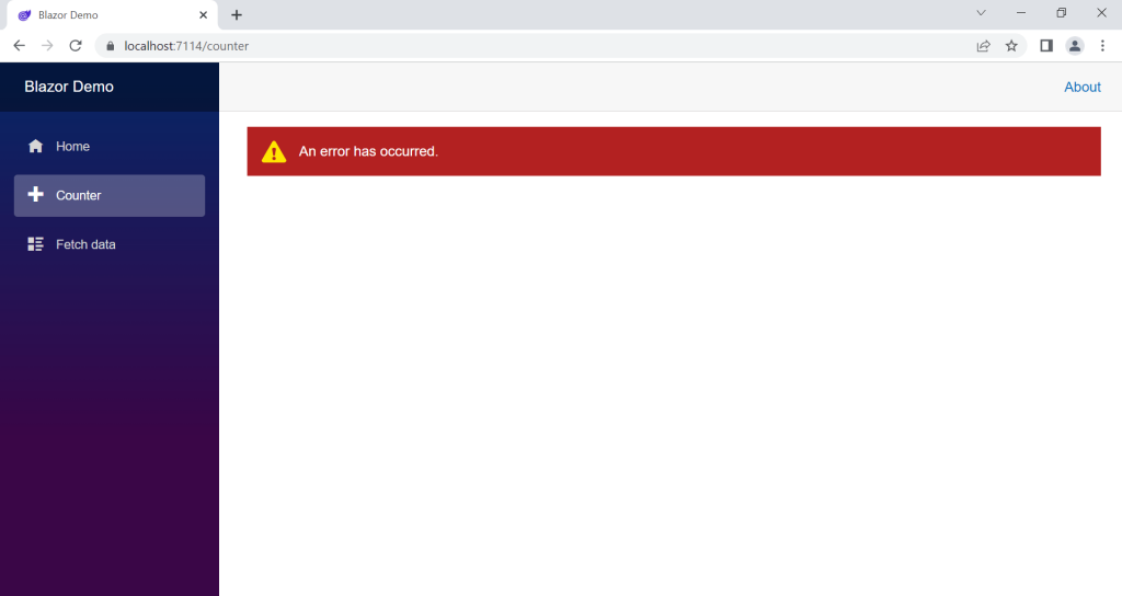
Nice! It’s certainly a welcome change from the dreaded exception bar.
The styling of the ErrorBoundary component is enabled by the following CSS within the default ‘app.css’ file.
.blazor-error-boundary {
    background: url(data:image/svg+xml;base64,PHN2ZyB3aWR0aD0iNTYiIGhlaWdodD0iNDkiIHhtbG5zPSJodHRwOi8vd3d3LnczLm9yZy8yMDAwL3N2ZyIgeG1sbnM6eGxpbms9Imh0dHA6Ly93d3cudzMub3JnLzE5OTkveGxpbmsiIG92ZXJmbG93PSJoaWRkZW4iPjxkZWZzPjxjbGlwUGF0aCBpZD0iY2xpcDAiPjxyZWN0IHg9IjIzNSIgeT0iNTEiIHdpZHRoPSI1NiIgaGVpZ2h0PSI0OSIvPjwvY2xpcFBhdGg+PC9kZWZzPjxnIGNsaXAtcGF0aD0idXJsKCNjbGlwMCkiIHRyYW5zZm9ybT0idHJhbnNsYXRlKC0yMzUgLTUxKSI+PHBhdGggZD0iTTI2My41MDYgNTFDMjY0LjcxNyA1MSAyNjUuODEzIDUxLjQ4MzcgMjY2LjYwNiA1Mi4yNjU4TDI2Ny4wNTIgNTIuNzk4NyAyNjcuNTM5IDUzLjYyODMgMjkwLjE4NSA5Mi4xODMxIDI5MC41NDUgOTIuNzk1IDI5MC42NTYgOTIuOTk2QzI5MC44NzcgOTMuNTEzIDI5MSA5NC4wODE1IDI5MSA5NC42NzgyIDI5MSA5Ny4wNjUxIDI4OS4wMzggOTkgMjg2LjYxNyA5OUwyNDAuMzgzIDk5QzIzNy45NjMgOTkgMjM2IDk3LjA2NTEgMjM2IDk0LjY3ODIgMjM2IDk0LjM3OTkgMjM2LjAzMSA5NC4wODg2IDIzNi4wODkgOTMuODA3MkwyMzYuMzM4IDkzLjAxNjIgMjM2Ljg1OCA5Mi4xMzE0IDI1OS40NzMgNTMuNjI5NCAyNTkuOTYxIDUyLjc5ODUgMjYwLjQwNyA1Mi4yNjU4QzI2MS4yIDUxLjQ4MzcgMjYyLjI5NiA1MSAyNjMuNTA2IDUxWk0yNjMuNTg2IDY2LjAxODNDMjYwLjczNyA2Ni4wMTgzIDI1OS4zMTMgNjcuMTI0NSAyNTkuMzEzIDY5LjMzNyAyNTkuMzEzIDY5LjYxMDIgMjU5LjMzMiA2OS44NjA4IDI1OS4zNzEgNzAuMDg4N0wyNjEuNzk1IDg0LjAxNjEgMjY1LjM4IDg0LjAxNjEgMjY3LjgyMSA2OS43NDc1QzI2Ny44NiA2OS43MzA5IDI2Ny44NzkgNjkuNTg3NyAyNjcuODc5IDY5LjMxNzkgMjY3Ljg3OSA2Ny4xMTgyIDI2Ni40NDggNjYuMDE4MyAyNjMuNTg2IDY2LjAxODNaTTI2My41NzYgODYuMDU0N0MyNjEuMDQ5IDg2LjA1NDcgMjU5Ljc4NiA4Ny4zMDA1IDI1OS43ODYgODkuNzkyMSAyNTkuNzg2IDkyLjI4MzcgMjYxLjA0OSA5My41Mjk1IDI2My41NzYgOTMuNTI5NSAyNjYuMTE2IDkzLjUyOTUgMjY3LjM4NyA5Mi4yODM3IDI2Ny4zODcgODkuNzkyMSAyNjcuMzg3IDg3LjMwMDUgMjY2LjExNiA4Ni4wNTQ3IDI2My41NzYgODYuMDU0N1oiIGZpbGw9IiNGRkU1MDAiIGZpbGwtcnVsZT0iZXZlbm9kZCIvPjwvZz48L3N2Zz4=) no-repeat 1rem/1.8rem, #b32121;
    padding: 1rem 1rem 1rem 3.7rem;
    color: white;
}

    .blazor-error-boundary::after {
        content: "An error has occurred."
    }
As per the exception bar, you are free to adjust this styling according to your needs. However, it’s also possible to amend the content that is output from the error boundary to include whatever markup and components you wish to display.
Custom error content
To customise the error content that is displayed by the ErrorBoundary component, you simply need to avail of the ErrorContent render fragment.
<!-- Prior code omitted for brevity --> <article class="content px-4"> <ErrorBoundary> <ChildContent> @Body </ChildContent> <ErrorContent> <p>💥 Something blew up!</p> </ErrorContent> </ErrorBoundary> </article> <!-- Remainder of code omitted for brevity -->
In the updated example above, the ChildContent render fragment contains the content that is rendered when everything is working as expected. If an unexpected error occurs, the markup contained within the ErrorContent render fragment will be used instead. In this case, the decimal reference for an explosion emoji and some custom text.
The following screenshot demonstrates the result.

Of course, the error content can be as custom as you like and can be made up of other components.
Accessing the exception
What if we want to get access to the exception that was raised?
The ErrorContent render fragment allows us to conveniently access the exception via a context object.
<!-- Prior code omitted for brevity -->
         <article class="content px-4">
            <ErrorBoundary>
                <ChildContent>
                    @Body
                </ChildContent>
                <ErrorContent>
                    <p class="fw-bold text-danger">@context.Message</p>
                </ErrorContent>
            </ErrorBoundary>
        </article>
<!-- Remainder of code omitted for brevity -->
In the above example, @context represents the instance of the Exception object. The Message property is accessed to display the exception message on the page, as demonstrated in the screenshot below.
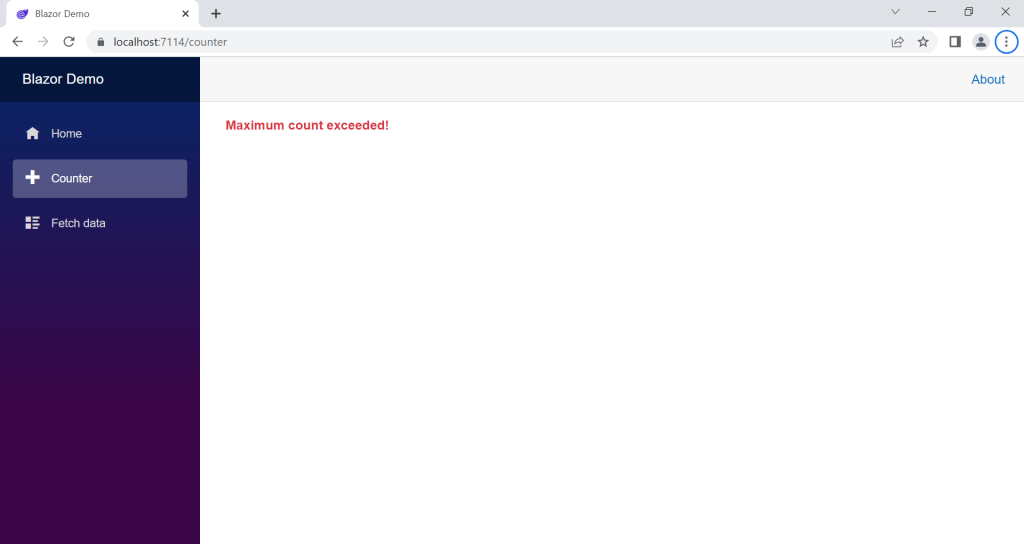
You’ll notice that the exception message visible in the above screenshot matches the message that is specified when the exception is thrown from the Counter component.
Error recovery
When an exception is caught by the error boundary, the error state of the boundary is not reset automatically. This presents a problem when the error boundary is defined at a high level in the component hierarchy, such as in the layout component.
After an error has occurred on the Counter page, when we try to navigate to another page, such as the Home page, the error content displayed by the error boundary remains in place.
To resolve this, we can use the Recover method of the error boundary, as demonstrated below.
<!-- Prior code omitted for brevity -->
        <article class="content px-4">
            <ErrorBoundary Context="exception" @ref="_errorBoundary">
                <ChildContent>
                    @Body
                </ChildContent>
                <ErrorContent>
                    <p class="fw-bold text-danger">@exception.Message</p>
                </ErrorContent>
            </ErrorBoundary>
        </article>
    </main>
</div>

@code {
    private ErrorBoundary? _errorBoundary;

    protected override void OnParametersSet()
    {
        _errorBoundary?.Recover();
    }
}
In the above example, a reference to the ErrorBoundary component is captured via the @ref attribute.
Within the OnParametersSet method, the Recover method is called which resets the error count and current exception state within the ErrorBoundary component.
In this updated example, notice that I’m now setting the Context parameter of the ErrorBoundary to “exception”. This means that I can access the exception within the ErrorContent render fragment using a name that is more natural i.e. @exception.Message.
Going further
When including the ErrorBoundary component within another component/page you can set the MaximumErrorCount parameter to an integer value. This parameter controls how many exceptions can occur before the component raises an unhandled exception and falls back to the exception bar.
Aside from this, that’s pretty much it when it comes to what you can do with the standard ErrorBoundary component.
If you want to go further with error boundaries, you can create your own custom component that inherits from ErrorBoundary. When you do this, you’ll get access to some protected members such as the CurrentException property and the OnErrorAsync method.
The OnErrorAsync method is called whenever an exception is being handled by the error boundary. The default implementation of the method logs the error using an injected IErrorBoundaryLogger object, allowing you to see the details of the error in the browser Console.
With a derived ErrorBoundary component you are free to extend the functionality to suit your specific needs.
Summary
In this article, I covered how error boundaries work within Blazor applications.
I’ve shown you what the default “yellow bar of death” looks like and how you can prevent it from appearing in your application unnecessarily by using error boundaries.
I walked through how to customise the content displayed by an error boundary, how to access the exception that was caught by the boundary, and how to recover from errors by resetting the error boundary state.
Lastly, I explained how you can take things further by creating a custom component that inherits from a standard error boundary and then proceed to implement the behaviour that is specific to your needs.
Comments
Alan Singfield
One issue I found with this was that it breaks navigationManager.NavigateTo().
It relies on throwing an unhandled NavigationException which is picked up by the framework and performs the redirect.
The solution is to inherit from ErrorBoundary, override OnErrorAsync() and throw if a NavigationException is received:
public class ErrorBoundaryEx : ErrorBoundary
{
[DebuggerStepThrough]
protected override Task OnErrorAsync(Exception exception)
{
// Rethrow NavigationException to allow navigation to work.
if(exception is NavigationException)
throw(exception);
return base.OnErrorAsync(exception);
November 27, 2023}
}
Jonathan Crozier
Hey Alan, that’s interesting, thank you for sharing!
November 27, 2023